
The Secret to Natural-Looking Dark Tones
When painting, it’s natural to reach for black whenever you need a darker color. However, many artists prefer creating dark tones by mixing colors instead. This simple technique often produces shadows that look richer, more vibrant, and closer to what we see in nature.
Why Mix Colors Instead of Using Black?
Pure black can sometimes make colors appear flat or dull, especially when used for shadows. By mixing colors, you create chromatic darks, deep tones with subtle undertones that blend more naturally with the rest of your palette.
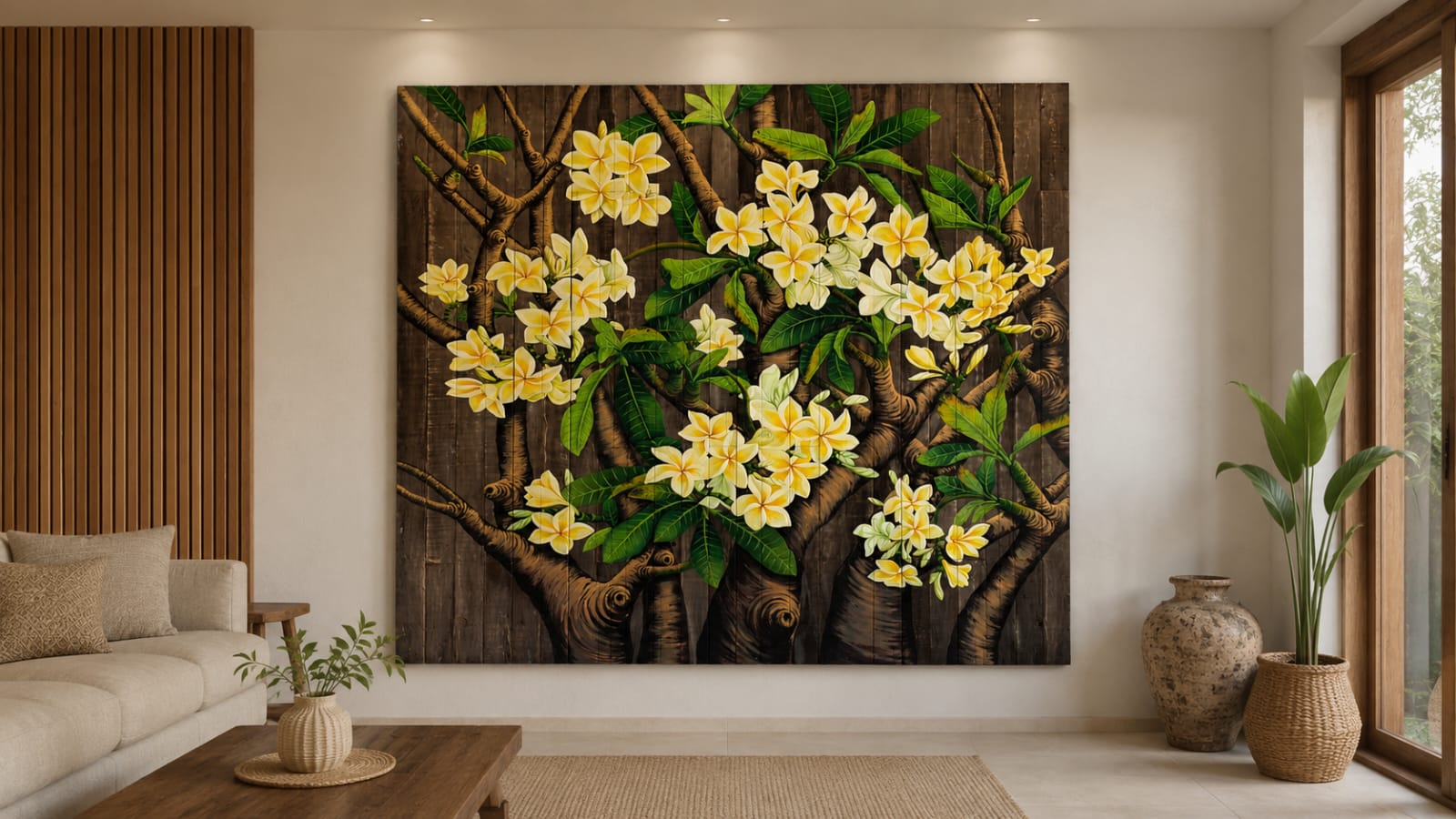
One advantage of mixing your own darks is controlling their temperature. For warmer dark add: Burnt Sienna, Burnt Umber, Red Oxide, Warm Reds. These work beautifully with wood, terracotta, and autumn inspired palettes.
For cooler darks add: Ultramarine Blue, Phthalo Blue, Prussian Blue, Dioxazine Purple, Payne’s Grey. These are ideal for water, night scenes, and cooler lighting.
Experiment with these classic color mixes to create beautiful dark tones:
- Prussian Blue + Red : natural looking dark tones, making it perfect for cool, dramatic shadows
- Ultramarine Blue + Burnt Umber : A balanced, neutral dark that’s perfect for natural shadows.
- Ultramarine Blue + Burnt Sienna : Creates warm, earthy darks, ideal for wood and terracotta.
- Alizarin Crimson + Phthalo Green : Produces a rich, cool chromatic black.
Take a closer look at the shadows around you. They’re rarely pure black. Instead, you’ll notice hints of blue, brown, purple, or even green, depending on the light and surrounding colors. Mixing your own dark tones helps capture these subtle variations, making your artwork feel more realistic and alive.
Avoiding black doesn’t mean you should never use it. Many artists still rely on black for graphic illustration, bold contrasts, or specific artistic styles. The key is knowing when black enhances a painting and when mixed darks can create a more natural effect.
If you’re aiming for richer, more lifelike shadows, try mixing your own dark tones using complementary colors or earth pigments. These combinations add subtle color variation, depth, and warmth that pure black often can’t provide.
Sometimes, the most beautiful “black” isn’t black at all, it’s a carefully balanced blend of colors that brings your artwork to life.
Eva S